Just because I am a boy mom does not mean I can not ADORE baby girl rooms. Correct?
I’ve attempted to decorate a baby girl nursery last year, for my friend Kelly, and it was a challenge for my non-girl-related brain. I give props to all you girl momma’s out there.
I originally spotted this bright orange & pink nursery below from an old friend that I use to dance with in college. I think I first came across it on her Facebook page.
I was immediately smitten. In every detail.
I am pretty sure if I did have a baby girl…her nursery would be a exact replica of this space. Great job Melissa and thank you for sharing with House of Rose readers!
___________________________________________________________________________
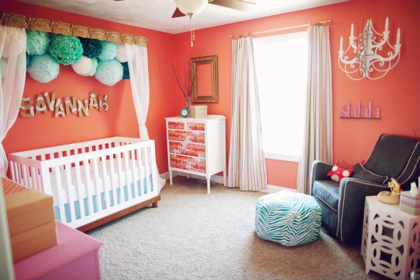
I started planning my daughter’s nursery by using Pinterest like crazy! I found a random image of aqua and coral tissue paper fans, and knew it’d be a perfect color scheme.
I love that the colors are girly, but are an unexpected turn from the typical light pinks and purples.
I knew finding bedding in those colors would be a bit difficult, so I searched Etsy for custom bedding and found a fabulous group of fabrics from a shop named mellissasboutique! (I later found out that she designed the bedding for Tori Spelling’s daughter Hattie – how cool is that?!)
My absolute favorite fabric of the bunch was Michael Miller coral scallop, which I used for the curtains and changing pad cover.
I based my paint colors around that fabric, and carried a swatch of it with me in my purse to reference whenever I found anything I considered buying for the room! The wall color is bold, but since it would be hard to find accessories in that exact color, I chose to use it for the walls. Turquoise seems to be a very common color option for accessories, so I knew it’d be easier to use it for the accents.
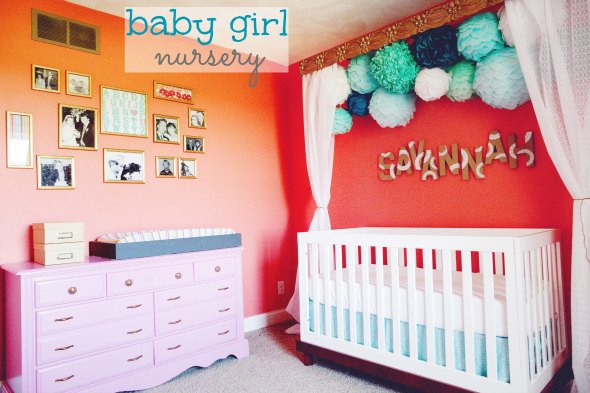
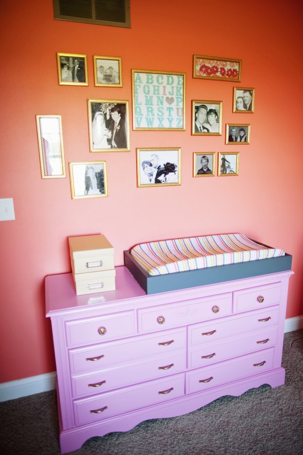
With my little fabric swatch in my pocket, I went to Menards and got exact paint matches of coral for the walls, pink for the dresser, and grey for the changing pad box! The pink dresser was originally finished wood and was my husband’s as a kid. He painted it with the custom pink color and I added antique-looking gold knobs that I found at Menards.
I can tell you that he never imagined his furniture would be painted pink, but he loves it! It’s a fun piece that has special meaning – and it was free. Can’t beat that!
I made a family tree of frames above the pink dresser, and I am not ashamed to admit that I copied the complete idea from Lay Baby Lay. The blog has tons of great inspiration boards for nurseries! I love holding my daughter and pointing to the faces of her family members and saying each name. I can’t wait until she can actually repeat them back! Although we are fortunate enough to have our families close, I think this is a great idea for children who have family members living far away.
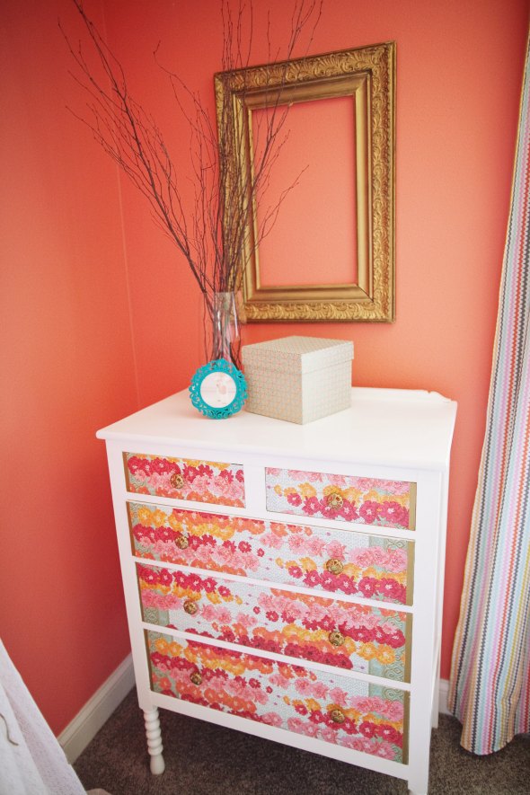
The tall dresser was an antique sale find. As with the rest of the painting projects for this room, I took full advantage of the no-painting-while-pregnant rule and sat on the couch with Ben & Jerry’s while my husband primed and painted the dresser white. (There ARE a few perks of pregnancy!)
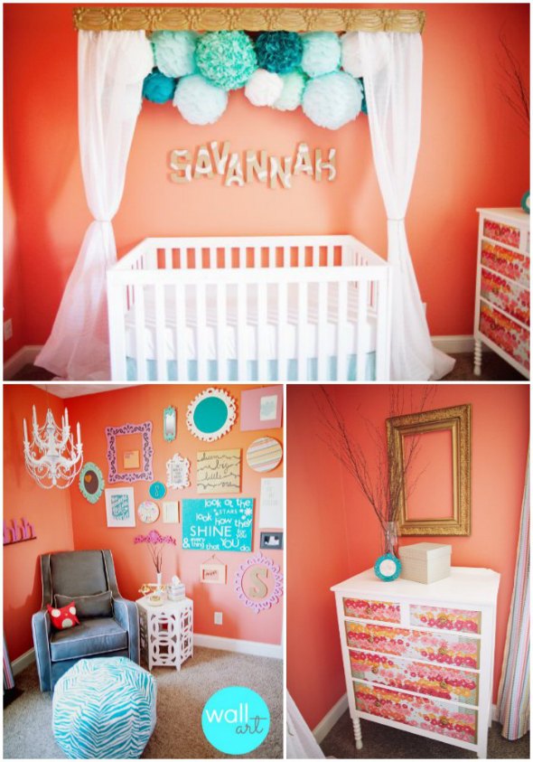
I did eventually get up and finish the dresser by using Mod Podge and cute floral paper from Paper Source to decoupage the front of the drawers. I just cut the paper to size and added a few coats of Mod Podge! New knobs from Menards gave it an antique accent to tie in with the rest of the gold in the room.
The gold piece above the crib is by far my favorite thing in the room! I found it at a local antique store when I was in my first trimester. At the time, I was convinced I was having a boy, but I bought it on the chance that I might be able to put it in a little girl’s room someday! I added lace fabric to make a little canopy, and decided different shades of teal poms would be the best accent color to fill the space.
Plain white paper lanterns are the base for all of the poms (you can find them at Hobby Lobby!) and were covered with circles of tissue paper, doilies, or circles of fabric. The tutorials can be found on the Project Nursery post, listed below.
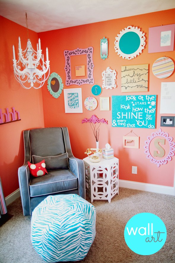
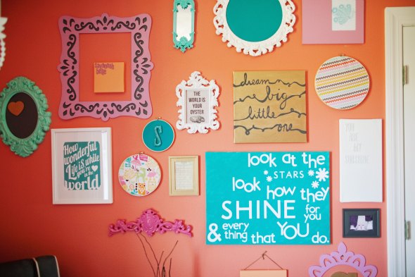
The gallery wall was such a challenge. I can’t even tell you how many nail holes are in that wall after moving everything around so many times! I learned that the spacing of a gallery wall is the most crucial part. The frames and content should be closer together rather than further apart, and the spacing should be consistent throughout.
Looking back, I would probably change a few things. While the wall color is unique, it is also a bit bold. A softer look with aqua walls would have been a nice choice as well. In that case, using the coral color to paint a piece of furniture would have been a great way to include the color without being overwhelming.
Also, hanging a bunch of glass picture frames above the changing table was possibly one of the most amateur first-time-mom moves I’ve made! DUH, why didn’t I realize that a 1 year old would have the capacity to kick the wall and knock them down during diaper changes?! My husband recently removed the changing pad and frame, so although diaper changes are now annoyingly taking place on the ground, it is much safer for the bebe.
Disclaimer: I realize this nursery does not look very practical! Ha! These photos were taken before my daughter ever slept in the room or really spent time in the room. The glass vase of branches obviously did not last long. She recently started grabbing the lace curtains, which I always knew would happen, so those are now gone. Normal nursery items like a humidifier, monitor, and diaper pail have been added. I added a vintage wire basket on the floor to hold toys, and a sheepskin rug from Ikea that adds some texture. Also, I did add a few details such as a tassel garland and paper fans to make it a bit more whimsical and fun.
The room has already proven to grow with her, and I think the non-traditional color scheme helped in doing so!
The complete list of sources can be found here.
[ois skin=”Home Tour 2″]
Melissa is the creator of Georgia & Jane, an Etsy shop with chic little handmade accessories for baby girls. You can find more of Melissa and her adorable ideas on her Facebook Page.
*Photography credit via Deidre Lynn Photography.


Such a fun and bright room! My favorite area is the chair corner with the chandelier, side table (love it!) and the colorful gallery wall. Beautiful job!
Love all of the poofy balls over the crib. That is one of the most gorgeous things I’ve ever seen!
This entire room is beautiful! I love all the pictures above the changing table. Funny how you took the pictures pre-baby entrance, I did the same thing! I didn’t have the diaper genie out, my pillows for nursing, extra toys, etc. 🙂
absolutely beautiful nursery! i love the lace curtains. too bad they didn’t last long. i love the Mid Podge idea! never thought to do that, but might try it for the next baby’s room!
What a sweet, girly room! I’m a boy mom, too, so I love living vicariously through girl mamas and their girly decor! You can tell so much time and love went into this space…what a lucky little princess to get to live here! Hope you’re having a great weekend, Mandy!
~Abby =)
What a fun room! I love the color scheme, and that gallery wall was worth every nail hole. 😉
I love the tissue balls over the crib. Im actually doing this in my little girls nursery. What did you use to hang them and how did you hang them? Thank you?
Amazing and it look gorgeous! Few months back i am 39 weeks. I really wanted a natural birth but ended up with a C-section. Having a healthy, screaming baby is all that matters in the end!