As you know, my husband and I are huge advocates {if that’s even the right word} of WordPress. We’ve been running all of our sites on Thesis since nearly the beginning of our blogs. We have really liked the capabilities that Thesis offers and are completely comfortable with working the back end.
It took me tons of time and research to become comfortable with it. {Tons is an understatement!}

And then Thesis came out with it’s newest update, Thesis 2.0.
I downloaded it….stared at my computer screen for 5 minutes and then called my husband crying.
I was THAT confused. I have no idea what the designers of Thesis were thinking when they updated to 2.0…but it’s horrendous.
Unless your college degree was in html. Mine however was not. And I am pretty sure the majority of the Internet peeps I roll with didn’t major in WordPress for dummies either.
So it’s been coming. The big switch. From Thesis to Genesis.
And my pits are sweating. And I have a headache. And I need ibprofen. Like a lot of ibprofen.
I am probably the worst at explaining what I want my site to look like. Mainly for 2 reasons:
1. Because I don’t know what I want it to look like
2. My ideas change by the minute
I just need someone to come over to my house, sit down next to me at my computer and let me show them all the things I like and don’t like about a layout. Except that’s impossible in the huge world of blog design. Most of the interaction you get with your designer…is via email.
And do you know how unclear email can be? GAH. It makes me crazy.
So I am now in the process of trying to explain to our designer how I want my site to be. Like every last detail all the way down to the color of my sidbar headings and text links. It’s making me feel like throwing in the towel altogether. Geez.
Why does site design have to be so difficult. And pricey. And why wasn’t I born with the ability to code websites from scratch?!
I’ve been going through a few StudioPress skins for Genesis and trying to pick one. But, seriously, not a single one is the right fit. So I started piecing together different ones and taking the features I liked from each and put them in a picmonkey image.
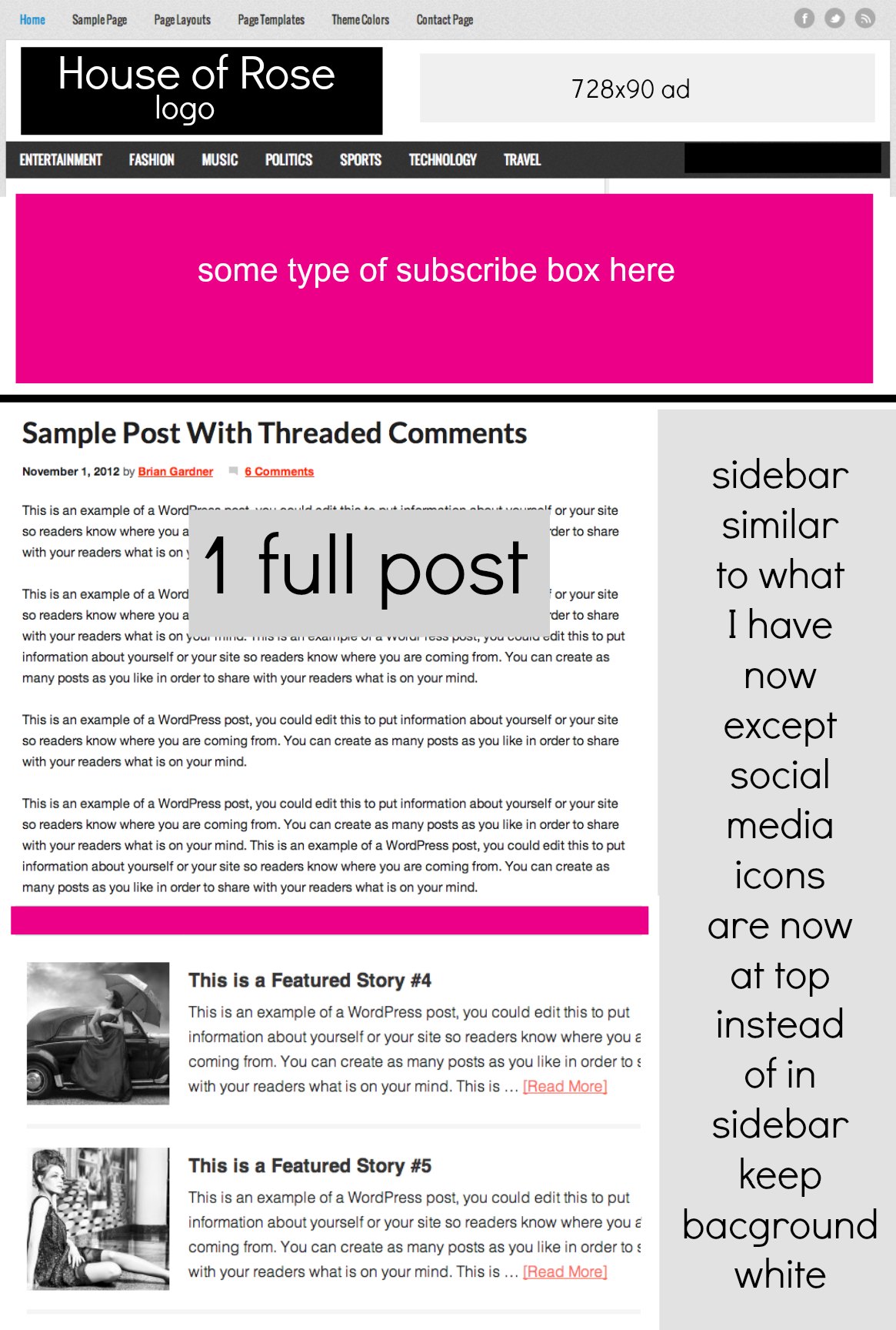
As you can see one of the biggest changes will be the size of my header. I love my header and there is no part of me that wants to change the look of it. It still fits me for now and so I plan to keep it {huge thank you to Jenn from Munchkin Land Designs}.
Right now it’s just too large. I want it to be smaller so that it’s not so overbearing.
Besides the header, I am wanting to add a “subscribe to my newsletter” box at the top that will incorporate pictures of what my blog is about. I don’t know how I envision that subscribe box yet, but I am working on it.
This is where YOU come in to play. I figure since the goal is to make my site more user friendly, more clickable, more readable…I would ask for your opinions on what you like about certain sites and what you don’t?
I need your help. Trust me…I’ve been at the coffee shop all morning with the hubs and neither of us are agreeing on what the layout should be.
Typical.
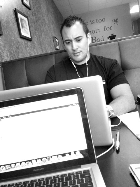
Maybe it’s because he can barely hear me with his darn head phones in. I ask him if he wears those so he can listen to Pandora or so that people won’t try and talk to him…of course he didn’t respond BECAUSE HE COULDN’T HEAR ME!
Gah!!!!
My MIL is here and I have time to actually THINK about this website layout stuff.

It’s pretty fantastic. I don’t have kids climbing up my legs and throwing balls at my head trying to get my attention. A break from that is much needed every now and then.
Please please please…leave your comments with any suggestions!
[ois skin=”Home Tour 2″]
I think the design layout you have come up with is great so far. I like your logo small at the top and i think the section for the newsletter subscription could be really great with pictures that define what your blog is about. I think it will really capture your audience at the top. They will learn about you really quick at first glance.
Boo change! And I understand ALL about the headphones. Ha. My husbands only accessory. Curious – why don’t you stay with 1.8.5?
I have Thesis 1.8.5 it hasn’t prompted me to upgrade. Wonder why they changed it? UGH! I run Genesis on a 2nd and 3rd website that I have.
I’m so relieved to read this! I’m a complete newbie at blogging and got Thesis 2.0 a month or two ago. After only 2 days of trying to figure it out (and watching tutorials) I got a refund and deleted it. I kept reading how user friendly it was and felt completely stupid for struggling with it so much. Pics at the top are a great idea, and I love your logo (I feel really unhelpful. Sorry!)
I’m no expert but I like what you’ve got in the example. It still looks user-friendly and all the important stuff is easy to find. The ads are in high traffic areas and the readers can see enough blog posts but not too much to where it’s overwhelming. I was a little worried you were going to re-do the header image so I’m glad to find out you’re keeping it! I hope the big move goes well!
You will love Genesis! I think your blog is awesome no matter what the layout is, so I’m sure that anything you do to it that makes it more inspiring for YOU will be great for us! 😀 Also, I would love to know what happens with ad converstions and newsletter signups after the switch — just because I’m a nerd like that. 😉
Good luck with the design! I completely understand what you mean about wanting to piece together the bits and pieces from other layouts you like. My blog is no where near the professional level, but I feel the same way about finding a layout that is *exactly* what I’m looking for.
As far as what I like as a user, I think I’d like more balance between all of the links on the right side of the page. It’s all useful information but I tend to get overwhelmed when it’s all grouped together on one side of the page (kind of like how I hate how mine is all grouped together at the bottom) so I tend to skip over it all together. Just my .02; I’ll still read regardless. 🙂
You’ll love Genesis 🙂 I’m in the process of picking a new theme right now as well … and it’s really difficult! Your choice will really define your blog … so. much. pressure! I like the one you’ve created … I was a full width header though and then 3 featured posts that will have rotating photos at the very top. But I also like your idea of an ‘upfront and center’ subscription bar. So many choices!
Oh my gosh I am the exact same way! I can’t decide on my blog layout either although I know HTML because I am a software developer but I still can’t decide how I want everything to be. Good luck, I am sure whatever you will do will be great!
I’m so excited about the changes you are making! I made the switch to Genesis with a child theme when I got a new designer. I love every aspect of it!
wow! even though it is hard work, its exciting….i think it will look good either way…excited for the new changes
Mandy I have been with Genesis since I migrated to a self hosted WordPress! I love love love it! The support forum is amazing!!!!!
Ugh, this is exactly why I haven’t made the switch to Genesis yet either, I don’t like one single theme enough to say, “that’s the one!” and I have no money to pay a designer to create one for me. Boo. I can’t wait to see what you come up with!
The only suggestion I would offer you (and who am I to be giving YOU suggestions?!), is if there’s any way to make your YouTube link more prominent in your sidebar, I would do it. You are so natural on camera and your vlogs make your blog so inviting and unique. Anything you can do to highlight that would do well for you (IMHO).
Good luck with the transition!!
Your layout looks great so far! I’d love to see a way to navagate to your longer or on-going series; like Love&Marriage, and the photography and cleaning series’.
Good luck on your transition! I love your blog, very inspriring 🙂
I use genesis and the glitter and lace theme. 🙂 good luck girl!
I couldn’t do it…switch to Thesis 2.0. I did just switch to Genesis and it’s simple (for now I’m on Prose but working with my designer on what would actually fit best). I’ve been following a lot of bloggers and it seems like most of them who were on Thesis are now or are going to Genesis. Good luck!
Alyssa, You asked why not stay with Thesis 1.8.5. Well I have Thesis 1.8 (somehow did not upgrade to 1.8.5). What I am coping with now is the fact that the pre-2.0 version of Thesis does not play nice with WordPress. My pages and posts are filled with glitches that not even HTML overwrites can solve. I believe that DIY has abandoned Thesis 1.8.5 in order to make everyone upgrade to 2.0. The only problem is they designed 2.0 for web developers instead of ordinary people.
It is very encouraging to hear that so many people here have switched to Genesis and like/love it.
Now to choose a theme…