Hold up, hold up. You are not on the wrong blog. You are, indeed, still at House of Rose.
That’s right.
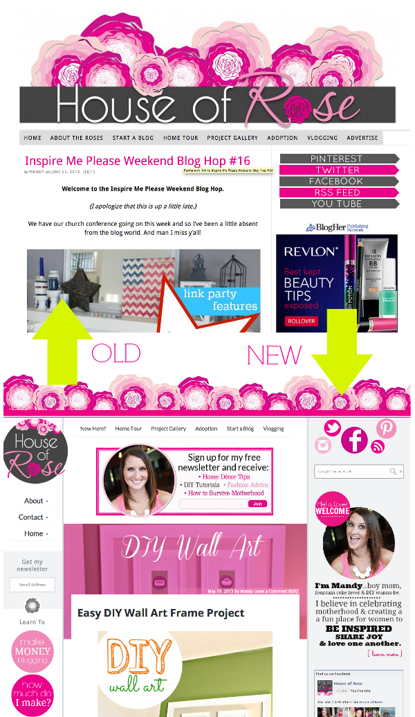
My new design is LIVE. Finally.

Some things may look the same {pretty lil roses} and other things {number of columns}…not so much.
I have never, in my 5 years of blogging, done a complete design makeover.
I guess you could say that I’m a girl that doesn’t like change much. Even in this new design you will see that I have incorporated some of my old elements.
One of the reasons for that is branding. I feel like the roses are “me” and when I took away the roses…it felt like something was missing. So, after contemplating and worrying and analyzing, the roses are staying.

Not only did my design change, but I also went from Thesis to Genesis. Hold me.
One of my goals with this custom site design was to make it easy for you to find things.

There’s been a lot of hard work involved in customizing my new site exactly how I want it to be. Huge thanks to Jenn, from Munchkin-Land Designs, for coming up with my new logo and massive thanks to Larry, from Side Income Blogging, who was the brains behind the whole thing.
The redesign is a work in progress…minor tweaks are still being made. If you see something that doesn’t look right {missing pages, funky spacing, etc} please leave a comment and let me know.
So, what do you think?
Just remember…change always takes time to get use to.


I actually prefer your old design! It was a much cleaner design and easier to navigate. Also loved your old logo across top. This page seems too busy. But good luck with new design!
Mandy, I love the new design! I feel it’s more modern and really seems to fit your personality! I’m glad you kept the roses! I’m not a wife or mother yet *working on it* but I love your blog! It’s one of my favorites!
Thank you so much!!!
I love it Mandy…so happy you kept the roses, it is your trademark! I can’t wait to explore around but it looks really great! ~Sonya
Thanks Sonya!! That means a lot!
I am SO glad you kept the roses. We can’t have Mandy and House of Rose blog without them:-) I love the modern, playful feel of the new design and adore the new logo. Great job!! I know all the hard work, sweat and tears that go into a redesign. You should be really proud. I look forward to exploring the new site.
Yes! It does take a lot of work so I completely appreciate your kind words!! Thank you!
I also think it’s beautiful. I hope someday I can afford for someone to do a total redesign for me. I have what I want up in my head. Hope I can make it a reality someday. Good luck.
Thank you very much!
The new design looks awesome girl!! LOVE it!!
Makes me even more excited for my new site!!
Thanks Tonya! Excited about your new site!
It looks fabulous! I love it!!
Thanks Shay! That means a lot!
I am also glad you kept the roses. Everything looks great!
Glad you like it! Thank you!
I think it looks great!
Thank you!!
I love when someone gets a new blog design! Yours looks great! Very clean and organized. 🙂 XO
Thank you Diana! 🙂
Love the new site! Looks great! More updated with 2013.
So cute! I love it!
I’m so glad you kept the roses! It’s such an important part of your branding & image! Lots of changes but I’m sure we’ll all get used to it soon!
Thanks Carrie!
You asked…so…I like the new design for the most part, however, the “pop up” ad across the bottom is SUPER annoying (yes I know you can close it, but having one more thing to click on isn’t really user friendly?) Also, the little pop up with the logos for social media are annoying. they are right over the words in some areas of the post, they are even covering up part of my words here in the comment box. When you scroll, it scrolls too. I’ve seen this on other blogs and I can say it makes me not read those on a daily basis. Then, the ad at the top of the page is a sort of confusing. I looked there and thought, that’s not her logo is it? It’s also not the name of the blog, so when my eyes are drawn up there, I think it’s going to be information pertaining to your site or telling me where to go or who you are…one last thing…on the side where it says “learn to” and below that the two circles say “make money blogging” and “how much do I make”. I was thinking “how much do I make” doesn’t really fall under the category of “learn to”. Just trying to help and give my honest opinion:)
PS: I’m reading from an iPad so it could look different here than on a computer. But 95% of the time I’m reading on here or an iPhone;)
No worries…it’s not configured right for the mobile or ipad/tablet yet. Still having those issues worked out! 🙂
I like it a lot! And, it’s much easier to read from a mobile browser (I read a lot from my iPhone as I’m feeding my son or putting him to sleep). I’m also looking for a new blog design so it’s great to get ideas.
PS – love the blog. Would read it anyway even if I didn’t like the design 🙂
I actually love the design. You are rockin’ the different shades of pink! My favorite part (for whatever silly reason) is the stationary buttons on the left for connecting with you on FB, Twitter, Pinterest, and Google +
No complaints from me! 🙂
Thanks so much Barb!!
The new design looks great! The roses are great and it ties the old and new sites together. It took me a second to realize the comments are at the top of the post, but it looks a lot cleaner and all of your important topics/links are prominent and easy to find.
I know…that was new to me to! Still getting use to it! LOL! Thanks for the kind words!
I honestly LOVE your new design. Very original. Your blog is very inspiring to us who are just starting out :).
Thanks so much!!
Hey Mandy, the new setup looks great, and like everyone else, I am glad you kept the roses. I just switched my old BlogSpot to a wordpress with the help of your “starting a blog” post and the videos from your hubby. So THANKS always enjoy your posts!
That’s awesome! So glad the tutorials helped! And thanks for the support!
The design seems too wide. I have a very wide monitor and I had to use full screen mode. Otherwise the content on your right column bumps down and is stuck “below” your center column.
LOVE the new look!
Thanks a ton!!!
Love the new look! That’s for all your advice, I used you to start my blog!
Thank you Joy!! So glad you found it helpful!! Can’t wait to go check out your new site!
Thanks…lol not that’s
I think it looks GREAT! I’ve been a reader for awhile, and I love how organized your site is!!
It’s so pretty, Mandy! Everything is so well laid out and easy to navigate. I love that it is so YOU–girly, fun, and beautiful! Congrats on the change! I know it was a big process! Hope you’re having a great week, friend!
~Abby =)
Thank you Abby!
LOVE it. The top header is super lovely. And the site has a uniqueness to it that I have not seen before. Nice work girl!
Thanks Daria!!